Pocket-Sized Mastery for Scroll-Stopping Posts
Swipe-Worthy Learning in Minutes
Hook the First Second
One Idea per Card

End with a Tiny Action
Writing That Lands Before the Scroll

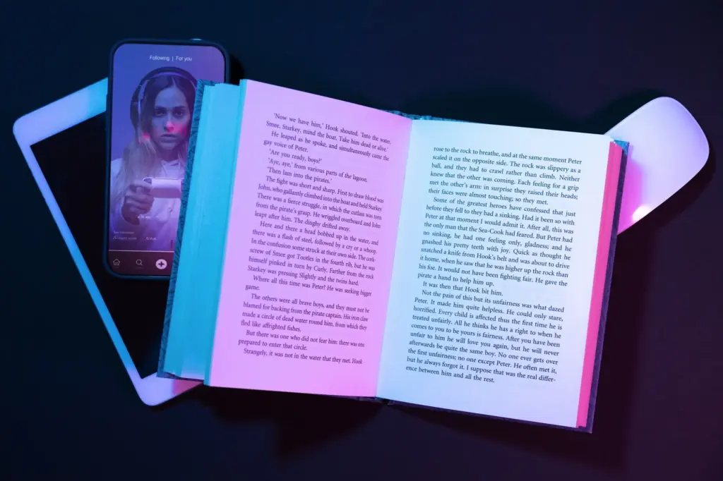
Thumb-Stopping Hooks

Readable Rhythm for Small Screens
Designs That Shine on Pocket Screens
Type That Survives Compression
Prioritize robust sans-serifs, confident weights, and ample letter spacing for tiny screens and lossy exports. Keep headline words under control to prevent awkward wraps. Test at 0.8x scale to simulate worst-case visibility. Avoid ultra-thin outlines, busy shadows, and decorative flourishes that smear. If two fonts compete, demote one to supporting roles. Your words must remain readable on the bus, in bright sun, and inside platform carousels that squeeze and crop unpredictably.
Color and Contrast in Sunlight
Contrast is kindness. Start with grayscale, solve hierarchy, then layer color intentionally. Use accessible contrast ratios for text overlays, considering platform darkening and auto-caption backplates. Test your palette against both system light and dark modes. Pop accents should guide attention, not shout everywhere. Simulate outdoor glare by maxing brightness and tilting your phone. If crucial details vanish, simplify gradients, lift midtones, and anchor elements with subtle borders that survive compression artifacts.
Safe Zones and Crops Across Platforms
Every platform steals edges for buttons, captions, and progress bars. Reserve central safe zones for essential text and faces. Prebuild frames for 9:16, 4:5, and 1:1, mirroring how feeds actually crop. Keep crucial elements away from top and bottom overlays. Export test posts with guide layers, then view inside native apps before publishing. Document what gets hidden on TikTok versus Instagram, and standardize templates so your storytelling never loses its punch to UI collisions.
Fast Tools, Faster Iterations
Template Systems that Flex
Prototyping in the Platform

Feedback Loops in 24 Hours
Data-Led Refinements Without the Guesswork
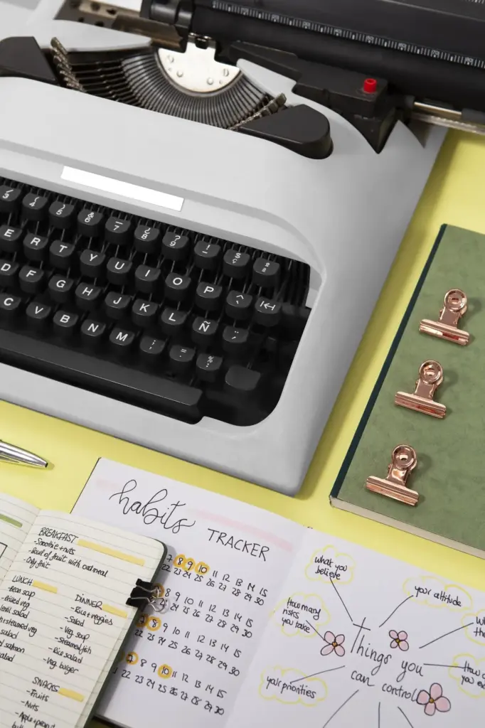
Sustainable Habits for Daily Publishing
Batching without Losing Freshness
A Reusable Lesson Library

All Rights Reserved.