Pocket-Sized Mastery for Scroll-Stopping Posts

Today we dive into Mobile-First Micro Lessons for Social Media Copy and Graphics, turning tiny screens into big results through ultra-focused, minutes-long skills that compound with daily practice. Expect punchy copy frameworks, thumb-friendly layouts, and rapid iteration habits that fit between meetings. Save this guide, try one experiment immediately, and tell us your fastest win in the comments so we can learn together, refine together, and keep building momentum one micro improvement at a time.

Swipe-Worthy Learning in Minutes

Micro lessons shine because small, specific steps are easier to start, easier to repeat, and easier to measure. By shaping each takeaway for a single scroll, you respect attention while accelerating skill acquisition. Think of every card, frame, or slide as one useful moment that stacks with the next, building confidence through visible progress. Use constraints on word count, visual elements, and time to spark creativity, reduce friction, and keep experiments lightweight enough to actually finish today, not someday.

Hook the First Second

Open with a clear promise, vivid contradiction, or surprising statistic that earns the next swipe without tricks. Bold verbs and concrete outcomes beat generic slogans every time. If your first line cannot pass a one-second test on a crowded train, rewrite until it does. Record yourself reading it aloud; breathy pauses reveal fluff. Imagine a rushing thumb and deliver something unmistakably valuable before that thumb decides to keep flying.

One Idea per Card

Resist the urge to stack advice. A single, finished thought lands harder and gets remembered longer. Use a tight headline, one clarifying sentence, and a tiny example that lives comfortably on a phone. When tempted to add more, spin it into the next micro lesson. Consistency creates narrative gravity across posts, while brevity protects comprehension under glare, motion, and notifications. Clarity compounds when your audience knows exactly what changed for them, right now.

End with a Tiny Action

Always close with a frictionless step the reader can complete in under two minutes. Suggest a rewrite, a layout swap, or a color contrast test. Micro actions turn interest into skill and reveal whether your advice truly works. Ask for a reply containing their before-and-after, which fuels conversation and teaches you where people struggle. The smaller the step, the more likely it happens today, strengthening a habit loop that sustains long-term growth.

Writing That Lands Before the Scroll

Copy for pocket screens must be scannable, rhythmic, and precise. Dense paragraphs collapse under thumb pressure, while focused lines glide and stick. Lead with outcomes, not introspection. Use familiar words, short beats, and patterns that play nicely with captions, overlays, and auto-translated interfaces. Test your lines at 90 percent zoom and on an actual phone in sunlight. Your words should remain crystal clear when notifications arrive, the train jerks, and the reader has five seconds left.

Thumb-Stopping Hooks

Build hooks from tensions your audience already feels: slow design cycles, weak engagement, muddy visuals. Promise a practical shift, not a miracle. Numbers, timeframes, or unexpected pairings add credibility fast. Try, for example, “Fix unreadable Reels text in five taps,” instead of “Improve your designs.” Speak to the job-to-be-done, not vanity. When you can say, show, and time-box the result, your hook feels useful, trustworthy, and shareable during a crowded commute.

Readable Rhythm for Small Screens

Short sentences and deliberate line breaks create momentum, but rhythm matters more than length alone. Alternate punchy statements with clarifying phrases. Keep one idea per line where possible. Avoid jargon unless your audience uses it daily. Emojis can mark beats and add tone when used sparingly. Read everything out loud and trim where your voice stumbles. If your caption still makes sense with the screen half-covered by a thumb, you are very close.

Designs That Shine on Pocket Screens

Mobile environments punish clutter and reward intention. Compression, glare, and motion blur are constant antagonists, so design for harsh realities, not studio monitors. Embrace generous spacing, heavyweight type, and ruthless hierarchy. Choose color palettes that hold contrast through platform processing. Preflight your assets on different phones, aspect ratios, and brightness levels. Remember that captions, stickers, and UI overlays will fight your layout. Leave breathing room, guide the eye, and let one visual idea win decisively.

Type That Survives Compression

Prioritize robust sans-serifs, confident weights, and ample letter spacing for tiny screens and lossy exports. Keep headline words under control to prevent awkward wraps. Test at 0.8x scale to simulate worst-case visibility. Avoid ultra-thin outlines, busy shadows, and decorative flourishes that smear. If two fonts compete, demote one to supporting roles. Your words must remain readable on the bus, in bright sun, and inside platform carousels that squeeze and crop unpredictably.

Color and Contrast in Sunlight

Contrast is kindness. Start with grayscale, solve hierarchy, then layer color intentionally. Use accessible contrast ratios for text overlays, considering platform darkening and auto-caption backplates. Test your palette against both system light and dark modes. Pop accents should guide attention, not shout everywhere. Simulate outdoor glare by maxing brightness and tilting your phone. If crucial details vanish, simplify gradients, lift midtones, and anchor elements with subtle borders that survive compression artifacts.

Safe Zones and Crops Across Platforms

Every platform steals edges for buttons, captions, and progress bars. Reserve central safe zones for essential text and faces. Prebuild frames for 9:16, 4:5, and 1:1, mirroring how feeds actually crop. Keep crucial elements away from top and bottom overlays. Export test posts with guide layers, then view inside native apps before publishing. Document what gets hidden on TikTok versus Instagram, and standardize templates so your storytelling never loses its punch to UI collisions.

Fast Tools, Faster Iterations

Template Systems that Flex

Create a family of layouts sharing grid, spacing, and type decisions, then vary textures, imagery, and accent colors to preserve freshness. Lock foundational elements so experiments stay consistent. Store reusable blurbs, hooks, and CTAs right inside your design file. When a post hits, tag and duplicate it for rapid variations. Systems remove decision fatigue, enabling you to focus on ideas while keeping output cohesive across stories, carousels, and short-form videos.

Prototyping in the Platform

Build drafts directly inside TikTok, Instagram, or Shorts to catch caption limits, sticker overlaps, and timing oddities early. Native tools reveal real friction points that polished editors hide. Export lo-fi versions, solicit quick reactions, and refine only what demonstrably matters. When you design where your audience consumes, you trade theoretical polish for practical clarity. The result is faster shipping, clearer messages, and content shaped by constraints your viewer actually experiences daily.

Feedback Loops in 24 Hours

Set a rule: every post earns at least three pieces of feedback within a day. Ask one peer for craft notes, one follower for clarity checks, and one outsider for immediate gut reactions. Track what confused them, what delighted them, and what they remembered tomorrow. Use that intelligence to adjust hooks, structure, and pacing on the very next micro lesson, turning critique into compounding advantage rather than a deferred wishlist of someday improvements.

Data-Led Refinements Without the Guesswork

Data becomes powerful when aligned with human stories. Collect just enough metrics to inform your next decision, not enough to drown your instincts. Focus on retention within the first three seconds, tap-through rates on carousels, and comment quality over count. Pair numbers with surprising DMs and repeated questions from your audience. Each insight should translate into a single, testable change you can deploy tomorrow, keeping learning cycles tight, actionable, and sustainable.

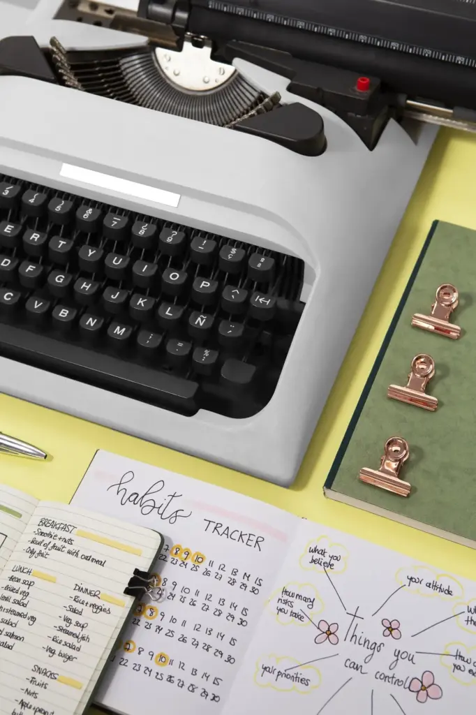
Sustainable Habits for Daily Publishing

Consistency grows when friction shrinks. Protect a small, sacred window each day for drafting, templating, or reviewing analytics. Keep capture tools ready for sparks: voice memos, pinned notes, or camera roll folders. Design your week with batching, light editing sprints, and one rest day to restore taste. Celebrate finished, not perfect. Invite your audience to co-create by suggesting experiments. Together, you build a cadence that survives meetings, travel, and the inevitable dips in motivation.

Batching without Losing Freshness

Draft multiple hooks in one session, then pair them with visuals later to avoid creative blending. Rotate topics and formats so batches feel lively, not stale. Keep a variety of examples, metaphors, and analogies on hand. Leave one piece unfinished on purpose to ease tomorrow’s start. Batching should reduce switching costs while preserving curiosity. If everything starts sounding the same, insert a field trip: screenshot audits, competitor swipes, or quick audience interviews.

A Reusable Lesson Library

Organize micro lessons by job-to-be-done, not platform alone: hooks, clarity fixes, contrast boosts, caption trims. Each entry needs a headline, a sixty-second explanation, an example, and a micro action. Tag assets with aspect ratios and safe-zone notes. Over time, your library becomes a creative runway where mixing and matching teaches faster than starting cold. Share the library index with subscribers and invite contributions, turning your practice into a living workshop that scales.
Virokaromira
Privacy Overview

This website uses cookies so that we can provide you with the best user experience possible. Cookie information is stored in your browser and performs functions such as recognising you when you return to our website and helping our team to understand which sections of the website you find most interesting and useful.